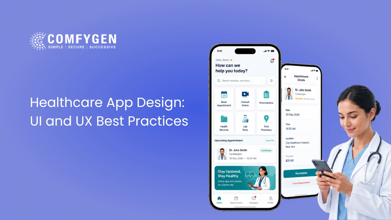





Healthcare app design has to serve two people with opposite needs at the same time. A patient opening the app is often stressed, sometimes unwell, and wants the fewest possible taps to get one thing done. A clinician opening the same platform has forty seconds between patients and needs a lot of information on one screen. Design for one and you lose the other.
That tension is what makes healthcare design different from consumer design. This guide covers how to resolve it: the dual-audience problem, accessibility standards that are legal requirements rather than nice-to-haves, colour and typography rules that hold up in clinical lighting, and the design mistakes that kill adoption after launch.
What Makes Healthcare App Design Different
In a shopping app, a confusing screen costs you a sale. In a healthcare app, a confusing screen can mean a missed dose, a missed appointment, or a patient who gives up and calls the clinic instead. The failure mode is different, so the standard is different.
Three constraints apply here that do not apply elsewhere.
Your users are not at their best: People open health apps when they are anxious, in pain, tired, or managing something serious. Cognitive load that would be fine in a banking app is not fine here.
Your users skew older: Health app usage rises with age, which inverts the assumption most product design starts from. Small text, low-contrast grey, and gesture-only navigation exclude a large share of your actual audience.
Compliance shapes the interface: Session timeouts, re-authentication, consent screens and audit trails are not design choices. They are requirements, and pretending otherwise produces a design that has to be rebuilt during compliance review.
Designing for Two Users: Patients and Doctors
Almost every healthcare platform has at least two interfaces. Treating them as one design system with one set of rules is the most common structural mistake in this space.
|
Design Consideration |
Patient interface |
Clinician interface |
|
Priority |
Low friction, few decisions |
Information density, speed |
|
Session length |
2 to 4 minutes, occasional |
All day, continuous |
|
Screens per task |
As few as possible |
Fewer clicks matters more than fewer screens |
|
Text |
Plain language, no jargon |
Clinical terminology expected |
|
Errors |
Forgiving, undoable |
Confirmable, auditable |
|
Emotional register |
Calm, reassuring |
Neutral, out of the way |
The practical answer is a shared design system with two applications of it. Same colour tokens, same type scale, same components. Different density settings, different default screen layouts, different navigation depth.
What does not work is designing the patient app first and then compressing it for clinicians. Clinical workflows have a different shape, and a compressed patient interface produces the exact thing clinicians complain about: too many clicks to do one routine thing.
Accessibility Standards Every Healthcare App Must Meet
WCAG 2.1 Level AA is the working standard for healthcare, and in several markets it carries legal weight. More practically, healthcare apps serve elderly patients, patients with visual impairment, patients with limited dexterity, and patients using a second language. Accessibility here is not an edge case, it is the median user.
Six Accessibility Rules That Matter Most
Contrast ratio: 4.5:1 minimum for body text, 3:1 for large text and interactive components. Light grey on white fails, and it is the most common failure in healthcare interfaces because designers borrow it from consumer SaaS.
Touch targets: 44 x 44 points minimum, with spacing between them. A patient with tremor or arthritis cannot hit a 32-point button reliably, and a mis-tap on a medication screen is not a small problem.
Type size: 16px minimum for body text, and support dynamic type so the OS accessibility setting actually changes your app. An app that ignores the system font size setting is broken for the users who need it most.
Screen reader support: Every interactive element labelled, every image with alt text, a logical focus order. Test with VoiceOver and TalkBack, not just with an automated checker.
Never use colour alone: Red for a critical vital and green for normal is unreadable for a colour-blind clinician. Pair colour with an icon, a label, or a shape.
Plain language: Aim for a reading level around grade 8 for patient-facing copy. “Take one tablet twice a day” beats “administer 1 tablet BID.”
Language and Localisation Support
If you serve a multilingual population, translation is not enough. Right-to-left layouts, longer word lengths in German and Hindi, and date and unit formats all break layouts that were designed in English only. Build the type scale and container widths to survive a 40% text expansion.
Colour and Typography in Healthcare App Design
How to Choose Colours for a Healthcare App
Blues and greens dominate healthcare interfaces for a reason. They read as calm and clinical. Reserve red exclusively for genuine alerts, because if red is also your brand accent, an actual critical alert stops registering.
Build a limited palette: one primary, one accent, one alert red, one success green, and a neutral grey scale with enough steps to hit contrast requirements at every level.
How to Choose Fonts That Stay Readable
Sans-serif, consistently. Inter, IBM Plex Sans, Source Sans and Roboto are all sound choices because they stay legible at small sizes and across screen densities. Avoid decorative or condensed faces entirely.
Keep the type scale short. Four to five sizes is enough. Long scales produce inconsistent screens and make the accessibility work harder.
Why Dark Mode Is a Clinical Requirement
This is the specification most healthcare apps get wrong. A nurse uses the same app under bright fluorescent lighting in a medication room, in a dark patient room at 3am, and next to a sunlit window on morning rounds. If the app is unreadable in any of those, staff stop using it and go back to whatever they used before.
Both light and dark modes need to hit contrast requirements independently. Testing dark mode only on a desk monitor in an office does not tell you whether it works on a ward.
How to Structure Navigation and Screens
Three taps to any core action: Booking, records, messages and prescriptions are the four features patients use most, so none of them should sit deeper than that. If a core action is deeper than three taps, the architecture is wrong.
Persistent navigation: Bottom tab bar on patient apps, side navigation on clinician dashboards. Do not hide primary navigation in a hamburger menu on a patient app, because discoverability matters more than screen real estate for infrequent users.
Search that works: Provider search by specialty, location, language and availability. Patients who cannot find the right doctor do not book.
Progressive disclosure for clinical data: Show the summary, let the clinician drill down. A full record dumped on one screen is as unusable as a record buried four levels deep.
Visible system state: Loading indicators, saved confirmations, sync status. In healthcare, a user who is not sure whether their action saved will do it again, and duplicate appointment bookings are a real support cost.
How to Design for Patient Trust
Patients hand over some of the most sensitive information they have. The interface either earns that or does not.
Show what is happening with the data. A short, plain-language line at the point of collection beats a privacy policy nobody opens. Make consent granular and reversible, so a patient can share records with one provider without sharing everything with everyone.
Make security visible but not obstructive. Biometric login is faster than a password and reads as more secure. A session timeout with a warning and a one-tap resume is fine. A silent timeout that loses a half-completed form is not.
Show credentials where they matter. Doctor profiles with qualifications, specialty, languages spoken and verified review counts do more for booking conversion than any visual polish.
Build a Better Healthcare App Experience
Transform your healthcare app with intuitive UI/UX strategies that improve usability, engagement, trust, and patient satisfaction.
Start Your Healthcare App Journey
Three Healthcare Apps Worth Studying
NHS App
Bundles GP booking, repeat prescriptions, record access and messaging into one flow for tens of millions of users. The design lesson is consolidation: patients would rather have four things in one app than four apps.
MyChart
Its strength is that every screen pulls from the same connected record, so lab results, messages, refills and billing are consistent rather than four separate mental models.
Ada Health
Built the entire interface around one feature, the symptom check, and framed it explicitly as guidance rather than diagnosis. A clear, honest framing did more for trust than a broader feature set would have.
Six Design Mistakes That Kill App Adoption
1. Designing for the buyer, not the user: The hospital administrator signs the contract. The nurse opens the app forty times a shift. Design for the nurse.
2. Consumer-app density on a clinician dashboard: Generous whitespace is right for patients and wrong for clinicians who need six data points in one glance.
3. Accessibility retrofitted after launch: Contrast, touch targets and dynamic type are structural. Adding them later means rebuilding the design system.
4. Gamification everywhere: Streaks and badges work for fitness and wellness. On a chronic disease management app they can read as trivialising, and on a mental health app they can actively harm engagement.
5. No offline state: Hospital wi-fi drops. An app that loses a half-written consultation note when the connection goes is an app clinicians will stop trusting.
6. Skipping usability testing with real users: Test with actual patients in your age range and actual clinicians during a real shift. Testing with the product team tells you nothing.
How Comfygen Approaches Healthcare App Design
Comfygen has been building healthcare software since 2019, with 550+ projects delivered across 30+ countries. Our design process starts with clinical workflow mapping rather than screens, because the interface is downstream of how people actually work.
Every healthcare interface we build is designed to WCAG 2.1 Level AA, prototyped and tested with end users before development starts, and built as a shared design system with separate patient and clinician applications. Design sits at step three of the healthcare app development process, after compliance architecture and before the first sprint, because an interface is downstream of both.
If you want a design audit of an existing healthcare app or a design partner for a new build, our healthcare app development team can walk through your current interface and identify what is costing you adoption.
Frequently Asked Questions
What makes healthcare app design different from other app design?
Healthcare apps serve two audiences with opposite needs, patients wanting low friction and clinicians wanting information density. Users are often stressed or unwell, skew older, and compliance requirements like session timeouts and consent screens shape the interface directly.
What accessibility standard should a healthcare app meet?
WCAG 2.1 Level AA. In practice that means 4.5:1 contrast for body text, 44-point minimum touch targets, 16px minimum body text with dynamic type support, full screen reader labelling, and never using colour alone to convey meaning.
What colours work best for healthcare apps?
Blues and greens read as calm and clinical and dominate the category. Keep red exclusively for genuine alerts, because using it as a brand accent means real alerts stop registering. Build a limited palette that hits contrast requirements at every step.
Does a healthcare app need dark mode?
Yes, if clinicians use it. Staff work under fluorescent light, in dark patient rooms at night, and in direct sunlight on rounds. Both modes must hit contrast requirements independently, and dark mode needs testing on a ward, not a desk.
How do you design one app for both patients and doctors?
Use a shared design system with two applications of it. Same colour tokens, type scale and components, but different density, layout and navigation depth. Do not design the patient app first and compress it for clinicians.
Should healthcare apps use gamification?
For fitness and wellness apps, yes. Progress bars and milestones work well there. For chronic disease management or mental health, gamification can trivialise a serious condition and reduce engagement. Match the register to the context.
How much does healthcare app design cost?
Design typically runs $5,000 to $50,000 depending on tier and sits inside the wider build budget, which for a mid-range healthcare app comes to $80,000 to $200,000 once development, compliance and integration are included.

Mr. Saddam Husen, (CTO)
Mr. Saddam Husen, CTO at Comfygen, is a renowned Blockchain expert and IT consultant with extensive experience in blockchain development, crypto wallets, DeFi, ICOs, and smart contracts. Passionate about digital transformation, he helps businesses harness blockchain technology’s potential, driving innovation and enhancing IT infrastructure for global success.